lilypond house style

lab briefpractice a unique engraving style with lilypond.
keywords
conductedJL 2020/06/04–ongoing

purpose

Music engravers, as solo practicioners (like me) or within teams at publishing houses, come to develop individuated house styles. Often the default features of scorewriter software allow for widely general use, with pleasing results over a large range of musical styles. However, as music notation is closely linked to the character of the music it expresses, developing unique design languages allows for specialization in the expression specific musical styles. As such, the purpose of this lab is to develop an engraving style with the lilypond language which is particular to a loosely related family of musical styles.

method

library

Score exerpts with desirable features are collected from existing engravings. For the application of engraving, the character of the music defining the notational style is minimally developed by the selection and completion of a single composition.

fonts

The direction is taken of working off of an initial combination of fonts (both text and music) rather than starting at glyph design. As a first approximation of the design's general character, a combination of existing fonts are selected: architectural lettering for text, and jazz standard style for music.

results

library

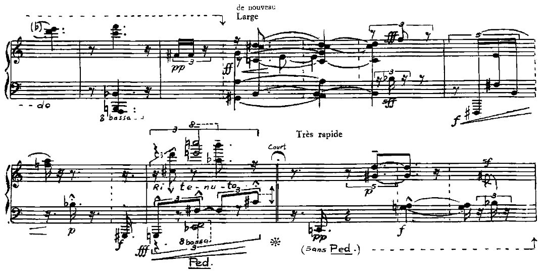
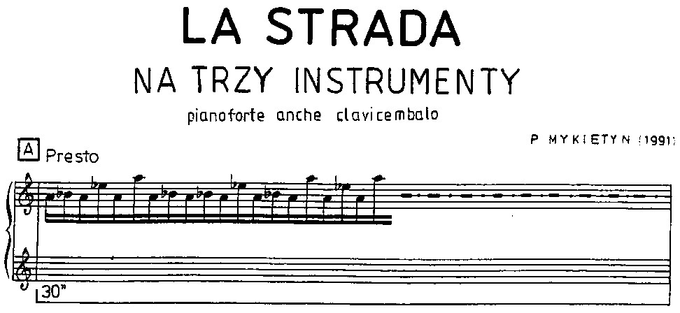
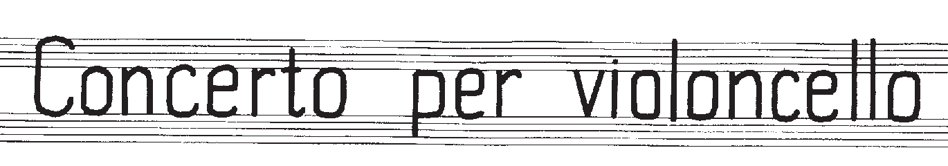
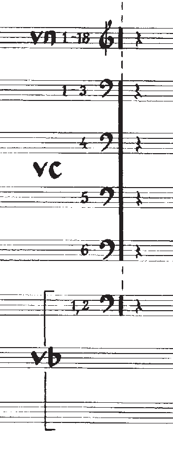
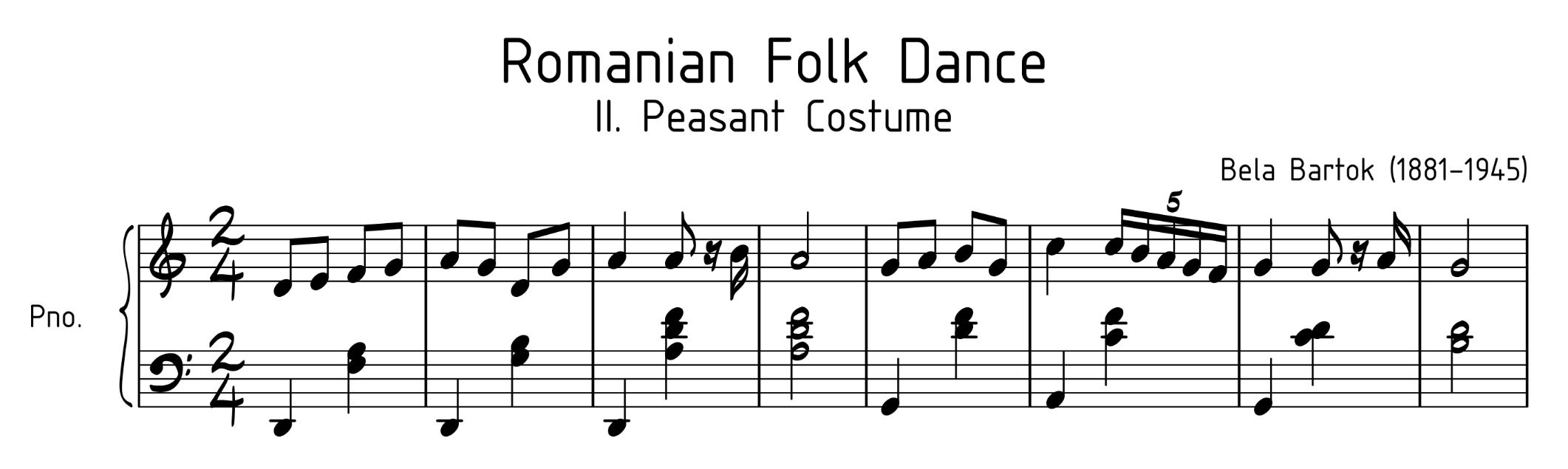
Curation of prior engravings have been collected here: by
composition
Barraque — Piano Sonata, Universal Editions (1920s?)
lettering
Mykietyn — La Strada, PWM Edition (1991)
Penderecki — Concerto for Cello, autography Ms. Penderecki (?)
glyph
The design's first baseline was aimed towards the relatively simple notational complexity of works within the roughly defined schools of minimalism and postminimalism. The house style has been said to be complete upon the production of Ann Southam's Song of the Varied Thrush: a moderately simple postminimalist string quartet which is __dated(currently) not engraved, published only as a autograph facsimile.

fonts

revision 1 — 2025/06/04.
This is not a sucessful combination of fonts. As a first approximation of an intended style, it has a few desirable features:
...and many undesirable ones:

further

fonts

More architectural lettering fonts will be sampled, as the current choice is globally ill-fitted. The music font is, given the small number of available SMuFL fonts, an appropriate base to begin modification.